Here's a piece for The Chronicle of Higher Education. It was the lead piece in the Views section, and the story focuses on the need for colleges to get on board with the sustainable food movement, i.e. growing their own food, or at least getting as much as possible from local sources, etc.
The article is titled "Fire Your Food Service and Grow Your Own," and much of it details the way most colleges, despite their commitment to many other hot issues, are very much dependent on Big Agribusiness for their food needs. With my first set of sketches, I was focused on "getting big business out of the food," and also on the idea that so much of the food comes from very, very far away. My favorite was the "registered trademark" symbol being plucked out of the bunch of grapes:
Well, missed the boat on that one... The editor replied that they wanted to focus more on agriculture, and the connection between colleges and the growing aspect. So, back to the drawing board, and ended up with the solution you see above, combining the "university column" with the idea of gardening, by way of a spading fork. You can also see Brian Taylor's "Zombie Marathon" at the top of the page. Sweet! Thank you again, Ellen!
Showing posts with label college. Show all posts
Showing posts with label college. Show all posts
Monday, March 18, 2013
Monday, October 15, 2012
LMU interiors
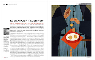
I know you've been super psyched for it... here it is, my recent project for LMU Magazine! I worked with Pentagram Design on the Fall 2012 issue of Loyola Marymount University's superbly designed publication (see recent awards here). I was commissioned to do four full-page interior illustrations:
For the first illustration, the client wanted an image that conveyed the idea of celebrating the success of the school, focusing on how it is a team effort. The second article is about providing access to college, ensuring that the road to higher education is open (and features their famous clock tower). The third article discusses the school's endowment, and how it provides funding for education. They requested that the hill upon which the school sits be in the composition. So any Angelenos out there may notice Marina del Rey (or my simplified interpretation of it) on the left of the illustration. The fourth article examines the Jesuit tradition of charitable donations for education, dating all the way back to St. Ignatius himself.
Most of my work is fairly simple, usually consisting of blocks or shapes of color (much like my piece for Harvard Law Bulletin that I'll be posting soon), sometimes with a small amount of photo-collage for texture and accents (like this). The client in this particular case requested that since the images were so large, that they have a lot of depth and texture, and not be too flat or simple. So they're a little different than my usual style and incorporate a little more photo-collage, but the Art Directors and the client were very happy with the way they turned out, and so am I. Thank you so much to Barrett and D.J.!
Up next: Harvard Law Bulletin.
Subscribe to:
Posts (Atom)


