Friday, March 1, 2013
Thank you, SID!
As I noted in my previous post, I went up to Colorado State University yesterday to speak to the AIGA Student Chapter, Students In Design, about my work, my influences and my experience as an illustrator. I wasn't sure how many graphic design students to expect, me being an illustrator, but the students at CSU get a good foundation during their time there, including learning principles of illustration, and there was a good turnout. Even those that aren't planning on being illustrators seemed to have a genuine interest in what I had to say, and I thank them for bearing with me as I nervously gave my spiel. A special thank you to Kacey, who got in touch with me a few weeks ago, and invited me up for the talk. And thank you to all the students, for your warm welcome and hospitality.


Wednesday, February 27, 2013
Where the sun don't shine
Actually, this is about a place where the sun is shining, compared to it's surrounding area. For Milwaukee Magazine, this illustration accompanies a story on Wauwatosa, or simply 'Tosa, a suburb of Milwaukee that the recession/depression most of the country is feeling has apparently skimmed over. The economy of 'Tosa is actually doing better now than it was before the crisis, while the surrounding areas trudge on through high unemployment, and low growth.

Here's the full page:

Thank you, Kathryn! Coming soon: 5280 and L.A. Times...

Here's the full page:

Thank you, Kathryn! Coming soon: 5280 and L.A. Times...
Monday, February 25, 2013
Valley of the Paper Dolls
I worked with St. Louis Magazine on an illustration for an article about parents choosing between private and public school for their children. They had the idea of showing a young child surrounded by various articles of clothing (normal "street" clothes, and the stereotypical private school attire) made to look like paper doll outfits.

The concept of a paper doll relates to the fact that the examples given in the article were all kids that had been in either private or public school, and switched to the other (paper doll clothing being very easy to change between, obviously). Here's the full page:

This was a fun little piece to work on. Thanks again, Rachel! Expect a few more posts in the coming week on other jobs about to publish...
On another note, I'll be giving a guest lecture to the AIGA Student Chapter at Colorado State University on Thursday evening. 7 PM, Room F101 in the Visual Arts Building. Obviously any CSU students interested in design/illustration are encouraged to attend. Be there or be square.

The concept of a paper doll relates to the fact that the examples given in the article were all kids that had been in either private or public school, and switched to the other (paper doll clothing being very easy to change between, obviously). Here's the full page:

This was a fun little piece to work on. Thanks again, Rachel! Expect a few more posts in the coming week on other jobs about to publish...
On another note, I'll be giving a guest lecture to the AIGA Student Chapter at Colorado State University on Thursday evening. 7 PM, Room F101 in the Visual Arts Building. Obviously any CSU students interested in design/illustration are encouraged to attend. Be there or be square.
Wednesday, February 6, 2013
I suck
At least at blogging. And probably lots of other things too, but blogging for sure. Well, for the two or three of you who read this blog (hi, Mom!), I'm still alive and well. I apologize that I haven't posted in a while. I have some work to share, but it will have to wait until it's published, unfortunately. With magazines it's always tough to pin that down exactly- I'm guessing end of February? So in the meantime, feel free to peruse some of my classic posts, such as "SND Award of Excellence," "NY Times Op-Ed," ( I wasn't very creative with the titles back then, huh?) "As promised," or the unforgettable "Inflight Club!" (Yes, this is my blog post version of a "clip show" episode.) Happy New Year!!
Friday, December 21, 2012
Burning Man/ Happy Holidays
This illustration appears in the interior of the current Seattle Weekly. It's about an old case from the 90s, in which Martin Pang plead guilty to, and was convicted of starting a fire in his parents' warehouse in Seattle, in order to collect on the insurance money. His little arson/fraud scheme ended up killing five firefighters in the SFD who showed up to fight the blaze. Although he was already convicted of the crime, his attorney has come forward with new evidence in the case. According to the story, the evidence doesn't do much to help his case.

I wanted to show how this man's fire-starting directly lead to the death of firefighters. I played with a lot of ideas combining images of death and the warehouse building (and other fire-starting paraphernalia, like matches, and lighters), but the trail of gasoline/accelerant forming the chalk outline of the firefighter was easily the right idea. Thanks again, Tom! Here it is by itself:

On another note, I want to wish a happy holiday to anyone and everyone that may come across this post. In the words of the great Krusty the Clown: "... have a Merry Christmas, Happy Hanukkah, Kwaaazy Kwanzaa, a Tip-Top Tet, and a Solemn, Dignified Ramadan."

I wanted to show how this man's fire-starting directly lead to the death of firefighters. I played with a lot of ideas combining images of death and the warehouse building (and other fire-starting paraphernalia, like matches, and lighters), but the trail of gasoline/accelerant forming the chalk outline of the firefighter was easily the right idea. Thanks again, Tom! Here it is by itself:

On another note, I want to wish a happy holiday to anyone and everyone that may come across this post. In the words of the great Krusty the Clown: "... have a Merry Christmas, Happy Hanukkah, Kwaaazy Kwanzaa, a Tip-Top Tet, and a Solemn, Dignified Ramadan."
Thursday, December 6, 2012
Off the chain
I finished this cover for the Dallas Observer last week. The story, "Rise of the Nones," is about atheists in Texas, and references the box that people check on the census listing their religious affiliation (atheists and agnostics checking "none"). It follows several individuals attempting to organize like-minded skeptics into a non-theist movement to rival the groups out there of a more religious persuasion, focusing not only on civics, but charity and other areas more traditionally associated with churches.

Organizing these fellow "nones" can be challenging due to the attitude toward atheists in this country. There are a few examples given in the story of atheists attempting to purchase ad space on billboards and in movie theaters simply announcing their existence, only to be rejected due to hostility from the public. I wanted the image to relate to the title, and also explain how many of these people feel tied down and unable to express themselves in public, due to intolerant views from some of their more religious peers. Breaking free of chains was the perfect metaphor, and wouldn't you know it, some of these religious symbols look a lot like chain links! Thank you, Tracie!

Organizing these fellow "nones" can be challenging due to the attitude toward atheists in this country. There are a few examples given in the story of atheists attempting to purchase ad space on billboards and in movie theaters simply announcing their existence, only to be rejected due to hostility from the public. I wanted the image to relate to the title, and also explain how many of these people feel tied down and unable to express themselves in public, due to intolerant views from some of their more religious peers. Breaking free of chains was the perfect metaphor, and wouldn't you know it, some of these religious symbols look a lot like chain links! Thank you, Tracie!
Wednesday, October 24, 2012
Lost in translation
This piece ran in last Sunday's L.A. Times. It was for the L.A. Affairs section, for a story that recounts the author's recent experience in that dark, dangerous, jungle we call the dating scene. She explains that after buying a beer for a guy she spotted across the bar, and after trying in vain to converse over the noise, asked if he wanted to step outside to chat (where the conversation might actually be audible). He (wrongly) interpreted that to mean: "Let's go back to your place, stud."

I wanted to show how her words went in one ear, and after going through all that machinery we humans have in our heads, is rearranged into something completely different. Read the essay here.

And in a first ever Draw Your Weapon Outtake, here's a thumbnail sketch that, while well received, was a little PG-13 for the section, and didn't make the cut.
 She's only thinking about opening up another beer, he's thinking about opening her pants. I think it would have been hilarious. Oh well, the AD and I both really liked how the final turned out.
Thank you to the wonderful Wes Bausmith for this very fun piece!

I wanted to show how her words went in one ear, and after going through all that machinery we humans have in our heads, is rearranged into something completely different. Read the essay here.

And in a first ever Draw Your Weapon Outtake, here's a thumbnail sketch that, while well received, was a little PG-13 for the section, and didn't make the cut.
Thank you to the wonderful Wes Bausmith for this very fun piece!
Thursday, October 18, 2012
Changeling
These past couple weeks I had been thinking that my illustration in 5280 would be out in next month's issue. Oops, nope, it's out now. Here's the piece, for an article about how Colorado has turned from red state to purple, and soon enough, due to the high number of Hispanic, young, female and urban voters, will be a pretty blue state:

Having a woman changing from red and purple clothes into blue seemed like a good idea, and combining the changing room with a voter booth just fell into place.

Like I said, the issue is out now if you want to check it out. Thank you, Dave!
Up next: L.A. Times.

Having a woman changing from red and purple clothes into blue seemed like a good idea, and combining the changing room with a voter booth just fell into place.

Like I said, the issue is out now if you want to check it out. Thank you, Dave!
Up next: L.A. Times.
Wednesday, October 17, 2012
Shell Game
I was commissioned for this piece for the Harvard Law Bulletin a few weeks back. The school's International Human Rights Clinic is following a case being heard in the Supreme Court, filed by Esther Kiobel on behalf of herself and several members of the Nigerian Ogoni tribe, against Royal Dutch Shell oil company (alleging crimes against humanity). Ronn, the art director, felt that a simple image connecting Shell with the Supreme Court would work well. I came up with this:

I think Ronn knows his stuff.

To read more about the case, see the article here. Thanks, Ronn!
Up next: 5280.

I think Ronn knows his stuff.

Up next: 5280.
Monday, October 15, 2012
LMU interiors
I know you've been super psyched for it... here it is, my recent project for LMU Magazine! I worked with Pentagram Design on the Fall 2012 issue of Loyola Marymount University's superbly designed publication (see recent awards here). I was commissioned to do four full-page interior illustrations:


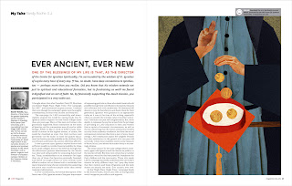
For the first illustration, the client wanted an image that conveyed the idea of celebrating the success of the school, focusing on how it is a team effort. The second article is about providing access to college, ensuring that the road to higher education is open (and features their famous clock tower). The third article discusses the school's endowment, and how it provides funding for education. They requested that the hill upon which the school sits be in the composition. So any Angelenos out there may notice Marina del Rey (or my simplified interpretation of it) on the left of the illustration. The fourth article examines the Jesuit tradition of charitable donations for education, dating all the way back to St. Ignatius himself.
Most of my work is fairly simple, usually consisting of blocks or shapes of color (much like my piece for Harvard Law Bulletin that I'll be posting soon), sometimes with a small amount of photo-collage for texture and accents (like this). The client in this particular case requested that since the images were so large, that they have a lot of depth and texture, and not be too flat or simple. So they're a little different than my usual style and incorporate a little more photo-collage, but the Art Directors and the client were very happy with the way they turned out, and so am I. Thank you so much to Barrett and D.J.!
Up next: Harvard Law Bulletin.


For the first illustration, the client wanted an image that conveyed the idea of celebrating the success of the school, focusing on how it is a team effort. The second article is about providing access to college, ensuring that the road to higher education is open (and features their famous clock tower). The third article discusses the school's endowment, and how it provides funding for education. They requested that the hill upon which the school sits be in the composition. So any Angelenos out there may notice Marina del Rey (or my simplified interpretation of it) on the left of the illustration. The fourth article examines the Jesuit tradition of charitable donations for education, dating all the way back to St. Ignatius himself.
Most of my work is fairly simple, usually consisting of blocks or shapes of color (much like my piece for Harvard Law Bulletin that I'll be posting soon), sometimes with a small amount of photo-collage for texture and accents (like this). The client in this particular case requested that since the images were so large, that they have a lot of depth and texture, and not be too flat or simple. So they're a little different than my usual style and incorporate a little more photo-collage, but the Art Directors and the client were very happy with the way they turned out, and so am I. Thank you so much to Barrett and D.J.!
Up next: Harvard Law Bulletin.
Thursday, October 11, 2012
You Dirty Rat
I finished this cover for a few Village Voice papers last week. It should be in the free weekly newsstands in Seattle, San Francisco, St. Louis and Broward/Palm Beach. The cover story goes over the ten most corrupt loopholes in the U.S. tax system. Corrupt because they allow very, very, very, very, very rich people to pay lower tax rates than the average citizen. A loophole is always viewed as a sneaky way to get around the system, and in an article dealing with lobbyists and politicians, what better way to illustrate that concept than a bunch of rats?

(SF Weekly AD: Andrew Nilsen)
Having the illustration run on the cover of several different titles, it's a little tricky ensuring the type will fit in for all the different layouts, but they seemed to work it out well. Thank you, Tom!
Up next: LMU!

(SF Weekly AD: Andrew Nilsen)
Having the illustration run on the cover of several different titles, it's a little tricky ensuring the type will fit in for all the different layouts, but they seemed to work it out well. Thank you, Tom!
Up next: LMU!
Thursday, October 4, 2012
Fandom of the Opera
Hello! Yes, I'm back from cryogenic hypersleep! Or so it would seem, since I skipped the whole month of September. I assure you it was due to an extremely busy month, and had absolutely nothing to do with laziness.
Anyway, as promised way back in August in my last post, here's a fairly recent piece from the Washington Post that finally ran this past weekend. The article centered around two books published this past year about opera. One of the books focused on how people fall in love with opera. The book makes the case that opera fans have more in common with sports fanatics, believe it or not.

This was just a little spot, and they wanted a very simple image showing a love for opera. Cupid's arrow through the fat lady's helmet seemed to be a good solution. Thank you, Kim!
Stay tuned for work in 5280, Harvard Law Bulletin, four full-pagers for LMU magazine and more. On another note, the Bordo Bello show is this Saturday night for anyone that's interested in attending. I think you have to buy tickets here to go. Six to ten, at Redline Gallery in Denver. Be there or be square.
Anyway, as promised way back in August in my last post, here's a fairly recent piece from the Washington Post that finally ran this past weekend. The article centered around two books published this past year about opera. One of the books focused on how people fall in love with opera. The book makes the case that opera fans have more in common with sports fanatics, believe it or not.

This was just a little spot, and they wanted a very simple image showing a love for opera. Cupid's arrow through the fat lady's helmet seemed to be a good solution. Thank you, Kim!
Stay tuned for work in 5280, Harvard Law Bulletin, four full-pagers for LMU magazine and more. On another note, the Bordo Bello show is this Saturday night for anyone that's interested in attending. I think you have to buy tickets here to go. Six to ten, at Redline Gallery in Denver. Be there or be square.
Friday, August 31, 2012
Bordo Bello 2012

Skateboards are obviously not rectangular, so there will be some trimming to this image, but you get the idea. I was sitting around, listening to music, wondering "what the hell am I going to put on a skateboard deck?" when "Today your Love, Tomorrow the World," by the Ramones comes on. Perfect.
Here's the page Shaw put together announcing my participation in this year's show. I don't know when the opening is scheduled, but I'll post as soon as I find out.
Also, coming soon to Draw Your Weapon: a Washington Post piece, a 5280 Magazine piece, and work for LMU magazine. To be posted whenever they're published.
Thursday, July 26, 2012
Ohhhhh, Mexico
My cover for the Phoenix New Times is out today. The story details the consequences of our American "War on Drugs" and former Mexican President Felipe Calderon's war on cartels. Since Calderon declared his war in 2006, some 100,000 people have been murdered in Mexico. For an explanation for the range of different death toll numbers read this. The cover article explains how despite the government claiming that "90% of the victims are criminals killed by other criminals," the truth seems to be much more complicated, and much more nefarious than that.

What makes the government line about most victims being criminals so incredible, is that so many journalists have been killed. Reporters that detail corruption in the army and police often end up murdered, to which the government responds with a convenient excuse that the reporters were likely killed because they were involved in the cartels. The vast majority of homicides are never investigated, and the crime is quickly swept under the rug. The story is a frightening but important look at how Mexico is being rotted from the inside out, as a result of our drug war. A war that is apparently soon to be waged in Africa as well. One of my early sketches mimicked the flag a little more- the skulls more closely resembled the shape of the cactus, and the foliage underneath was made up of drug paraphernalia- but we decided that was a little overkill.
Thank you, Peter!

What makes the government line about most victims being criminals so incredible, is that so many journalists have been killed. Reporters that detail corruption in the army and police often end up murdered, to which the government responds with a convenient excuse that the reporters were likely killed because they were involved in the cartels. The vast majority of homicides are never investigated, and the crime is quickly swept under the rug. The story is a frightening but important look at how Mexico is being rotted from the inside out, as a result of our drug war. A war that is apparently soon to be waged in Africa as well. One of my early sketches mimicked the flag a little more- the skulls more closely resembled the shape of the cactus, and the foliage underneath was made up of drug paraphernalia- but we decided that was a little overkill.
Tuesday, July 24, 2012
Not too young to get married
Didn't have much time to post this piece for the L.A. Times over the busy weekend, but it ran in Sunday's L.A. Affairs section. The story is by a woman who was just engaged for the first time at 37. She explains that getting married at that point in life gives her an advantage, as she has many friends' marriage experiences to learn from.

I wanted to focus on how the author uses her friends' marriages as guideposts for her own relationship, and this concept came pretty quickly. You can read the essay here. Thanks so much, Wes, for your input on this assignment and for your concern Friday morning.
Next post: a cover for the Phoenix New Times.

I wanted to focus on how the author uses her friends' marriages as guideposts for her own relationship, and this concept came pretty quickly. You can read the essay here. Thanks so much, Wes, for your input on this assignment and for your concern Friday morning.
Next post: a cover for the Phoenix New Times.
Subscribe to:
Posts (Atom)
